This is my model; its a bit worse for ware because it fell apart over the weekend in the prototype room, BUT here are pictures of it anyway:
p.s. My super glue dried up thus the lack of togetherness of my model
Doodles of Brilliance
Monday, 28 March 2011
Wednesday, 12 January 2011
Storyboard & Animatic
These are the animatic and the storyboard which show the basic version of how our camera work and final film will look like. Obviously a few bits will change when the final rendered version is made due to tests of camera angles not being s good as others.
The sound effects we all did together chose the sound-clips and decided where to have them come in or out.
My clips
Here are the clips from my camera work:
This is the first time I have used cameras before and I found it quite simple as I thought it was going to be much harder. To make smooth camera movements I parented cameras to circles so I could rotate them with ease and make the movements less jolty as moving it manually by using the move tool; it can be very robotic in it's movement.
This is the first time I have used cameras before and I found it quite simple as I thought it was going to be much harder. To make smooth camera movements I parented cameras to circles so I could rotate them with ease and make the movements less jolty as moving it manually by using the move tool; it can be very robotic in it's movement.
Details 2...
Around the platforms up the tower I decided to add railings to them but made them simple, nothing fancy as it wouldn't fit with the fact its a fancy lighthouse. So the idea was that the railings were the original railing but polished up.
I added brackets to the pipes so they look held into place and not floating in the air.
The pipes I made polished as well but instead of brass I made them copper piping with brass brackets. Littered around the environment they went collected in groups around the space.
The Details...
Littered around the environment I put pipes, radios, railings, etc. For the radios I went for an old receiver radio look including knobs. Like this:
I liked this style of radio as it looks at home within the style of environment I had in mind. My modelled version was slightly different to this with little poetic license on it.
I decided to add a funnel to it to give it an interesting look, I based the funnel on more of a gramophone record player then a kind of radio.
With the funnel I thought it added a quirky look to the detail of the radio and to the environment as a whole, as the place itself is a quirky machine. The modelling of this was quite straight forward as it was basic shapes, all it took was just some tweaking of the vertices.
Lighting...
For the lighting to stick with the polished and posh theme I decided to design a posh looking light. I was going to go in the direction of having chandeliers but thought with my lack of modelling experience I decided to make a simpler electric looking light which I placed within my tower and also been placed in the other rooms. Here are examples of them in action:
The way the area around the lamps are lit dimly which I thought added atmosphere to the environment. It created almost a noir styled shadows, which enhanced the regal and classy look.
Concept and Stuff...
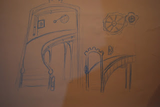
Through this project my job was to modelled, texture, light and film the inside of the lighthouse tower which is quite a main part of the environment. I started off drawing concepts from regal and posh looking staircases like the pictures below, here are some concepts I drew.
In there concepts there are a few ideas that never came into fruition such as the stair lift which wouldn't have looked as good as actual steps. From my concepts I did take certain ideas such as the huge entrance staircase which i thought looked very royal and looked stylish, although I modelled it slightly strangely when i realised this it was too late to go back to it so I soldiered on with it.
Also we decided not to do the character walking through the environment as it would add to the already big workload of our ambitious environment.
Subscribe to:
Comments (Atom)


