Wednesday 12 January 2011

Storyboard & Animatic


These are the animatic and the storyboard which show the basic version of how our camera work and final film will look like. Obviously a few bits will change when the final rendered version is made due to tests of camera angles not being s good as others.

The sound effects we all did together chose the sound-clips and decided where to have them come in or out.

My clips

Here are the clips from my camera work:


This is the first time I have used cameras before and I found it quite simple as I thought it was going to be much harder. To make smooth camera movements I parented cameras to circles so I could rotate them with ease and make the movements less jolty as moving it manually by using the move tool; it can be very robotic in it's movement.

Details 2...

Around the platforms up the tower I decided to add railings to them but made them simple, nothing fancy as it wouldn't fit with the fact its a fancy lighthouse. So the idea was that the railings were the original railing but polished up.


The pipes I made polished as well but instead of brass I made them copper piping with brass brackets. Littered around the environment they went collected in groups around the space. 


I added brackets to the pipes so they look held into place and not floating in the air.

The Details...

Littered around the environment I put pipes, radios, railings, etc. For the radios I went for an old receiver radio look including knobs. Like this: 

I liked this style of radio as it looks at home within the style of environment I had in mind. My modelled version was slightly different to this with little poetic license on it.


I decided to add a funnel to it to give it an interesting look, I based the funnel on more of a gramophone record player then a kind of radio.
With the funnel I thought it added a quirky look to the detail of the radio and to the environment as a whole, as the place itself is a quirky machine. The modelling of this was quite straight forward as it was basic shapes, all it took was just some tweaking of the vertices.


Lighting...

For the lighting to stick with the polished and posh theme I decided to design a posh looking light. I was going to go in the direction of having chandeliers but thought with my lack of modelling experience I decided to make a simpler electric looking light which I placed within my tower and also been placed in the other rooms. Here are examples of them in action:


The way the area around the lamps are lit dimly which I thought added atmosphere to the environment. It created almost a noir styled shadows, which enhanced the regal and classy look.

Concept and Stuff...

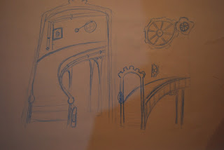
Through this project my job was to modelled, texture, light and film the inside of the lighthouse tower which is quite a main part of the environment. I started off drawing concepts from regal and posh looking staircases like the pictures below, here are some concepts I drew.


In there concepts there are a few ideas that never came into fruition such as the stair lift which wouldn't have looked as good as actual steps. From my concepts I did take certain ideas such as the huge entrance staircase which i thought looked very royal and looked stylish, although I modelled it slightly strangely when i realised this it was too late to go back to it so I soldiered on with it.

Also we decided not to do the character walking through the environment as it would add to the already big workload of our ambitious environment.

Monday 10 January 2011

Turn Table

Posed...

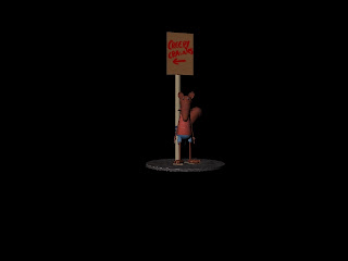
I gave my character a basic rig to pose him simply, which turned out not very good as I ran into trouble posing certain limbs which wouldn't bend or stay in shape. I worked around it eventually and gave him a basic pose of just standing there.


The base of the character i textured as tarmac as if he was standing on a zoo path which are usually tarmac. I gave the character a base so when i sent him to be printed he will be able to stand up on his own. I altered the model though for printing, i got rid of the sign and the baby reigns as they were to thin or fiddly to model in a 3d printer (which is in a long queue to be eventually printed). From this project I've learnt that I need to manage time more and definitely work on my modelling and texturing skills.

Textured

The texturing of my character was an interesting ordeal as it was the first time I've modelled and textured a character ever... The textures i decided to use were simple colours of play-dough and clay, to give it the hand made feel.


In keeping with the hand made style I thought it would be fun to keep it as if a child made it out of clay and the world he inhabits. The props I put around him are a sign saying "creepy crawlies <--- " in pen and the actual sign made out of a wooden stick and cardboard. It gave a fun feel to the scene as well as adding little touches to the sandals and baby reigns by texturing them out of cardboard as well as felt.

Starting off...

I started off slowly and kept the design simply so it would be easier for me to model and keep to the clay brief.


The look I aimed for was a sort of children's program look of simple shapes and soon to be simple colours. The idea would be close to the style of Peppa Pig and Morph which are simple shapes and colours suitable for children. This route seemed to be appropriate because Billiam sounded like a very child friendly character who would entertain them.


Ant Eaters

For my character I decided to choose Billiam Williamson who was the hyper-active 9year old who has an obsession with "creepy crawlies". This description gave me many ideas of normal human kids dressed up in insect costumes or just normal looking kids. But I thought why should it be human, whats stopping me from branching out into animals who love insects... not interested in them but love to eat them.

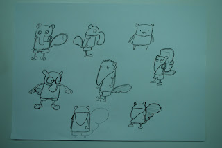
I went through a variety of animals and doodled some ideas. I went from Aardvarks to Chameleons, which was fun to produce a clay-mation styled version of it. Here are some pictures of my designs:


Through these designs i decided on choosing the Giant Anteater design which looked more cuddly and fun to do. The primary break down of the character is he is going to have a basic shape because thats how I would model him if he were really made out of clay, also to make modelling easier he is going to have big feet and hands.


Based the description of the character I decided to give him baby reigns as he is hyperactive and its the only way to control him. I went beyond the brief and thought it was a quirky idea.

Giant Anteaters...

Right this is my first post on my Industry Excercises project because I've been meaning to upload images from my sketch book but my scanner isn't working as of late, this means i haven't scanned in images for my other project for environments either.

This project gave us many different descriptions of other characters for the Character Animation brief. I chose the character William Billiam who is a 9years old, hyper active, obsessed with creepy crawlies. This was a very descriptive and precise description. Out of this we had to make an original and believable character.

From this description I began designing a range of characters using brainstorms of possible character designs (to be uploaded later).